The Tooltip Generator allows you to include text or a button on your pages that will show more or specific information about that text.
For example, hover over me to see how a tooltip works.
The Tooltip Generator can be customized to match the styling of your site.
To add a Tooltip to your Pages follow the instructions found below.
The Tooltips generator can be found under Tools Tooltips
Choose 'Create New Tooltip' from the drop down menu and click the button.

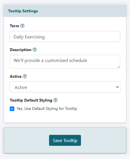
Tooltip Settings

Term
Enter the word or phrase that will appear as a 'live link' or 'button' on your page
Description
Enter the text that will appear when a user hovers over the button.
Active
Set the status of the tooltip to 'active' if this button should show on your pages. Set the status to 'inactive' if this tooltip button should not be shown on the page.
Tooltip Default Styling
Check the box if the colors, size and other styling using the default.
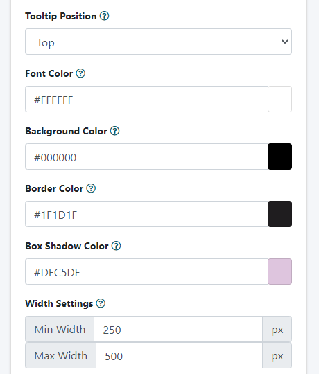
Custom Tooltip Styling
Uncheck the 'Default Tooltip Styling' box to set custom styling for the tooltip button.

Tooltip Position
From the drop down menu, choose the position where the tooltip will appear in relation to the text or button.
Colors
The font and button colors can be changed as desired.
Click in each box and enter the hexadecimal color if known, or click in the color box to choose a color.
Width
The min and max widths for the buttons can be set.
If a screensize is wide enough, the button will not exceed the max width, and it will not get smaller than the min width on smaller devices.
Press the button
Add the Tooltip to a Page
After the tooltip has been saved, a preview screen with the tooltips will appear.
The CF Tags will appear in the box below the preview. Copy the CF tag under the desired tooltip display and paste it into the content box for a page, department or portal page.
Plain Text Link:
Copy the full cf tag under the Plain Text Link

Button Link:
Copy the full cf tag under the button

