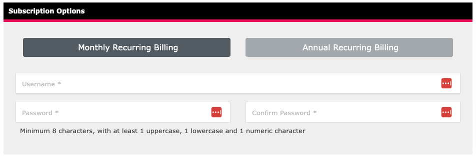
We're thrilled to announce the latest enhancements to our subscription form, designed to improve both the aesthetic and functional aspects of your user experience.
These new features are crafted to make subscribing smoother and more transparent, ensuring users have all the information they need at their fingertips.
Sleek, Modern Design
First up, we've revamped the look and feel of our subscription form. The new design is not just about aesthetics—it's about creating a more intuitive and user-friendly experience. With a cleaner layout, improved navigation, and a modern style, the new form ensures that users can easily understand and complete the subscription process with minimal effort. This fresh look is in line with current design trends, offering a visually pleasing experience that matches the high quality of our services.

Transparent Billing with the 'Today's Payment' Line
In addition to the design update, we've introduced a feature that adds even more clarity to the subscription process: the 'You Pay' line. This line provides a detailed breakdown of all billing details, including the total amount due today and future billing amounts. No more guessing or hidden fees—users will now have a clear understanding of exactly what they are paying at every step of their subscription journey. This transparency builds trust and ensures that users feel confident about their financial commitments.

Why These Features Matter
The modern design isn't just about looking good—it's about enhancing usability, reducing friction, and creating a seamless experience that can lead to higher conversion rates. Meanwhile, the 'Today's Payment' line is all about transparency, giving users peace of mind by clearly displaying all costs upfront. Together, these features make the subscription process easier, clearer, and more engaging, ultimately leading to happier users and fewer abandoned sign-ups.
We're confident that these new features will significantly enhance your experience with our software, and we can't wait for you to try them out!
